Collaborative Works
Educational Virtual Reality and Desktop video games created with Unity
Escape the isomeRoom - HTC Vive
Chemical compounds are spatial 3D structures which are notoriously difficult to understand on paper. This interactive virtual reality "escape the room" experience was designed and created to increase the excitement for learning while reinforcing the concept of optical isomerism. Players find themselves immersed within a virtual cave and are challenged to use audio and visual cues (and a cute lab mouse) to escape from turning into an evil, enantiomeric version of themselves!
Our Team
Talia rein (Weiss)
Project Manager
Andrea e. Schmitz
Asset Creation Lead
Andrea s. Kim
Programming Lead
Manjun (Emma) Chai
Asset and Programming Specialist
My Role
As the lead programmer, I wrote a total of 21 functions varying from assigning individual triggers to every interactable object, incorporating haptic and audio cues as well as molecule animations in response to specific activity, to creating the molecule vending machine (which I designed similarly to a calculator). I was also involved in the asset creation of all of the molecules as well as the basic structure of the machine, and had a small role in the overall UI/UX design of the game. Emma, my partner in crime, also had a heavy role in the writing of individual functions, however, we came across multiple bugs when combining our codes during what was supposed to be our "final" run of the game. 14 hours of debugging and about 3 energy drinks later, I was able to seam the functionalities together by rewriting just a few lines of code per script. Hurrah!
In this video, I am testing the molecule vending machine function I created within Unity on the computer before moving onto VR
In this video expertly put together by Talia, I am modeling the molecule vending machine function using the HTC Vive within a room-scale play area
A video screen-capture of the final gameplay is below. WARNING: this video contains spoilers; click at your own risk.
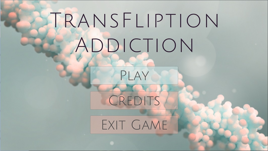
TransFliption Addiction -- Desktop/Web
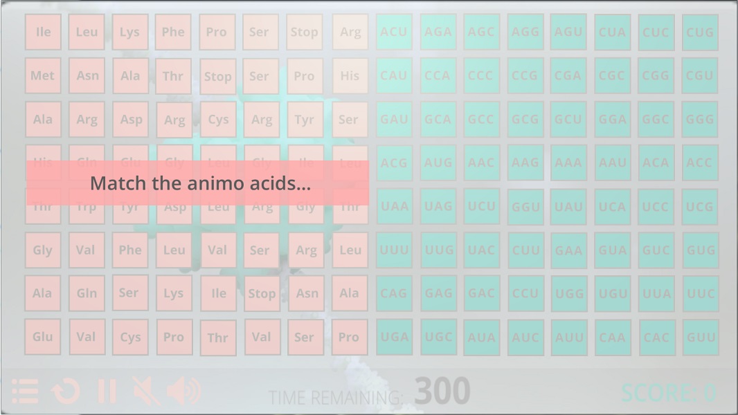
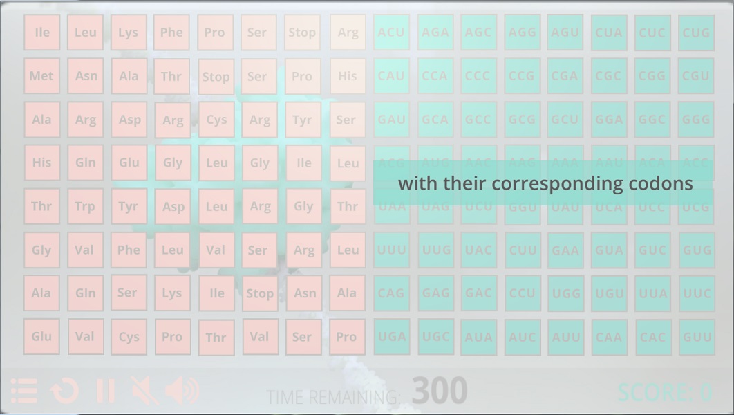
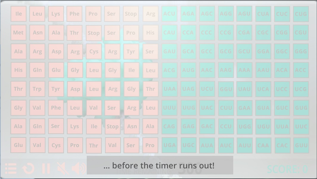
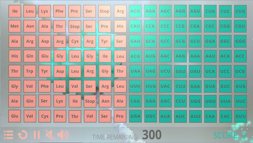
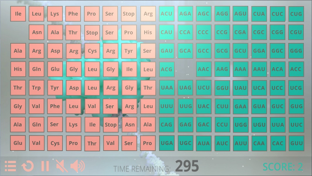
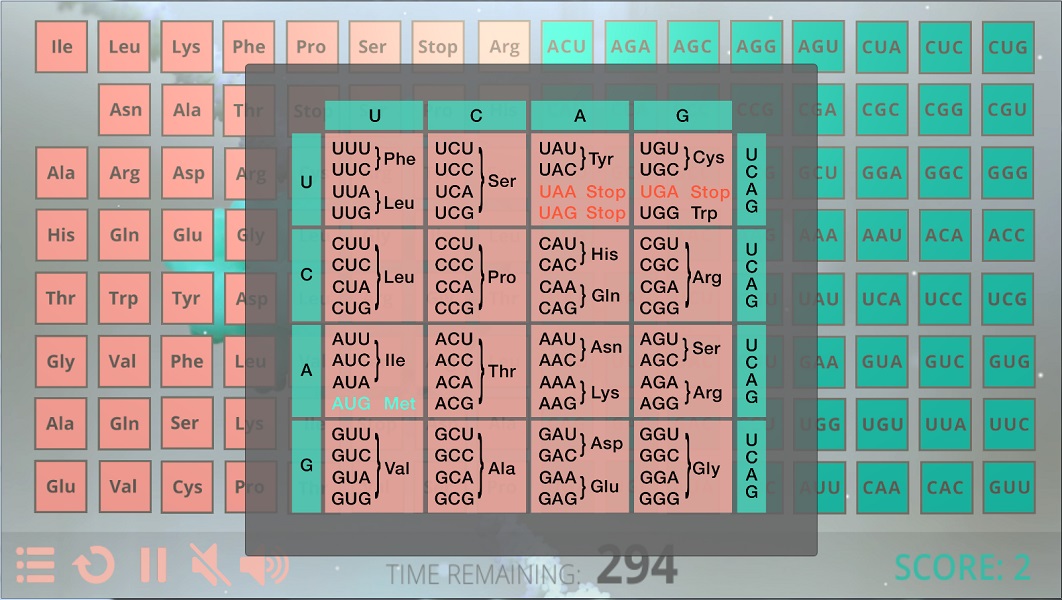
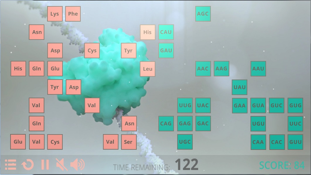
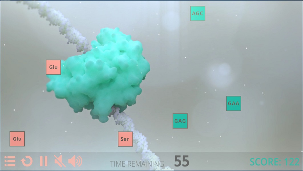
Have you memorized all of the codons and its paired amino acids? Yeah, I hadn't either... until we crafted this beautifully simple game in Unity! Using a mechanism inspired by the matching pairs card game, we were successful in maintaining our learning objectives while keeping the game fun to play for audiences ranging from high schoolers to scientists. Unlike the matching pairs card game, we designed our game such that players may view the content at all times as the location of each card did not add to our learning objective -- we're not THAT mean!
Our Team
Katelyn Peachock (Greenhill)
Asset Director
Andrea S. kim
UI/UX Director
James Riley Jones
Technical Director
My Role
As the UI/UX Director, I worked closely with Katie to ensure the buttons, color palette, and font (UI) matched her asset creations, and with Riley to establish a design that wouldn't overwhelm the programming aspect of this seemingly simple game (UX). Due to the nature of our game, I found most of the UI/UX design quite limiting -- except for how I wanted to present the tutorial, so I spent more time solving how to present the tutorial than other aspects.
Being a video gamer myself, I always hated having to read any bulk of text in the tutorial screen before starting the game. Often times I would find myself either skimming through the text, or skipping it entirely. Then, after failing at the game, I would either reluctantly go back to the tutorial screen or stop playing the game altogether. In my personal experience, the best design is one that either forces you to read line-by-line or one that appears the first time you click on a new element. Due to the simplicity of our game, the solution became quite obvious. See below:
HIVunity -- Android/iOS Tablet
How do you explain to a patient recently diagnosed with HIV what is happening in their body? (Hint* it has to do with immunity)
... Come back later to find out!


